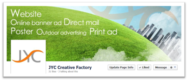
1. Maximize Your Cover Image
Starting fromMarch 2013, Facebook allows Fan Page to display web address, a call to action and more. The key is that text cannot exceed 20 % of the cover image area. If designed creatively, cover image provides a powerful opportunity to communicate key pieces of information to visitors

2. Evaluate Your Profile Image
 The 1st thing users see when glancing through posts in their news feed. To present you identity properly, it is best to upload a square-designed image. The 1st thing users see when glancing through posts in their news feed. To present you identity properly, it is best to upload a square-designed image.
Logo can help reinforce company branding but need to be simple, clear and easily identifiable.
3. Review Your Tab Thumbnails

Tab thumbnails appear below your cover image and lead to the apps in use on your Page. You can showcase 3 tab apps that are always visible to visitors on your Page. Remember, use simple fonts and shorten the subject to a few words.
4. Maximize Use of Tab Apps
Tab Apps offer interactive and incentive options that can draw visitors to your Page. They are commonly used for launching promotions, running contests and offering deals. Pages should at least feature a tab app that lets visitors sign up for the company email newsletter list. |
5.Use Short Description
 Description is presented in approximately 155 characters that display below the cover image. It outlines a concise statement about your business. Remember; list your website URL if possible. Description is presented in approximately 155 characters that display below the cover image. It outlines a concise statement about your business. Remember; list your website URL if possible.
| 


 Online
Branding
  Creative Campaign
  Strategic IT &
Business Consulting


 Online
Branding
  Creative Campaign
  Strategic IT &
Business Consulting