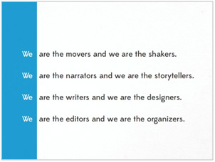
1. White space creates separation
Do you want to avoid slide clutter? Your audiences hate seeing overcrowding text and diagrams on a single title slide. If you can relate to these challenges, then you can understand the importance and need for white space. White space creates separation between objects and forces a designer to kill the clutter.

2. White space attracts the eyes
 White space is blank. There is absolutely nothing to look at when it is fully being utilized. Therefore, the good news is if it surrounds something, the “something” really stands out. White space is blank. There is absolutely nothing to look at when it is fully being utilized. Therefore, the good news is if it surrounds something, the “something” really stands out.
3. White space creates balance
Programs like PowerPoint allow designers to customize a seemingly infinite number of details such as the size, color, and shape of text and visuals. By adding white space, you can bring balance and harmony to a mix of design elements, such as a lengthy body of text and geometric shapes as shown in the web page below.

4. White space implies sophistication
Not sure if you aware, many of the world’s most admired and famous brands utilize white space. It screams luxury. It shouts elegance. Effectively use of white space stands for sophistication, high-class and uniqueness.

5. White space improves readability
If you want to give a deep impression of your slides, try to utilize white space because white space makes text easier to read. According to a study done at Wichita State University, white space actually increases comprehension and is more favorable to readers and observers.

Remember : white space – it’s simple, powerful and highly effective.
This newsletter is for information purposes only.The names of actual companies and products mentioned herein are the trademarks of the respective owners. | 


 Online
Branding
  Creative Campaign
  Strategic IT &
Business Consulting


 Online
Branding
  Creative Campaign
  Strategic IT &
Business Consulting